This is my secon blog post in the #FocusAccessibility themed January. Today I want to talk about a topic, that is probably not so common when talking about accessibility. Many of you might know how to optimize websites for visually impaired or blind people. But there are many different types of disabilities. Today I want to hightlight one, that probaly not many of you are aware of.
Motion-triggered vestibular spectrum disorder
The topic is pretty big, although largely unknown. In summary, it means that animations, motions, effects, etc. can harm people viewing a website. I can be a real thread to their health and can lead to epileptic seizure or other symptoms.
Yes, animations and effects are really nice and can make a website even more amazing. But do you really want to harm the visitors of your website? Probably not? But what can you do about it? First of all, get yourself familiar with this issue. There are good articles by Mozilla and A List Apart on that topic. There are also many different elements on your website, that can cause this issue. As I cannot cover all of them, I want to show you a simple way to reduce animations in your CSS code.
The “prefers-reduced-motion” media query
Fortunately modern browsers and operating systems can help you to improve your website to make it less harmful for those users. You can use the prefers-reduced-motion media query to either wrap all of your animations into it and only play them, when the settings is not set by the visitor of your site. Or you disable animations in this media query. You can find more information about that media query on a blog post by CSS-Tricks.
As an example, you can visit the website of WordCamp Europe 2020. The front page has an animation of the logo. Even though the logo is not an extreme example of harmful animations, there might still users who would prefer to have a static logo.
The Design Team of WordCamp Europe did an amazing job creating this animation with pure HTML and CSS code. But the animation was not wrap into the media query. If the CSS code would be wrapped into it, the animation would not start at all and the logo would not become visible. So how can we easily fix is?
“Fast foward” the animation
The fix was pretty easy. I just searched for all elements with a CSS animation on it and “fast fowarded” the animation by setting all delays and durations to zero second, so the logo would be fully visible on page load. The code looks like this:
@media (prefers-reduced-motion: reduce) {
    .wceuicon *,
    .wceuicon:before,
    .wceuicon:after,
    .wceu-logo-text * {
        animation-delay: 0s !important;
        animation-duration: 0s !important;
    }
}
With these few lines, the logo animation is deactivated and the website becomes more accessible.
Reduce the animation
Another solution would be a reduction of the animation. One problematic part of the logo is probably the “blinking cursor” and the “dots flying in”. We could create an animation, where the dots and the cursor would simply fade in on the designated positions in a slow animation. So we still have an animation, but one with a truely reduced motion.
Test the media query
Now you may wonder how to test the new media query. Many modern operating systems offer options. Mozilla has an overview of the supported browsers and where to find the option in different operating systems. On Google’s Developer platform you also find some more useful tips on the media query and how to test them.
Windows 10
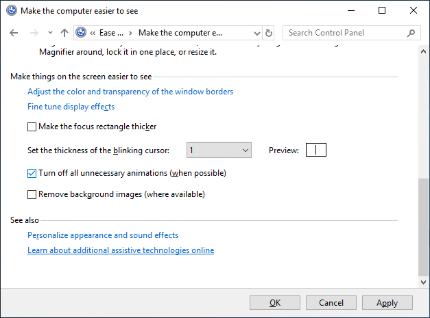
If you use Windows 10, you find the option at “Control Panel | Ease of Access |Ease of Access Center | Make the computer easier to see”:

Just activate the “Turn off all unnecessary animations (when possible)” checkbox. This setting will not only recude animations in the browser, but in all programs supporting that setting. After you applied the setting, reload the website with the animation. You should now see the optimized/reduces version.
Android 9
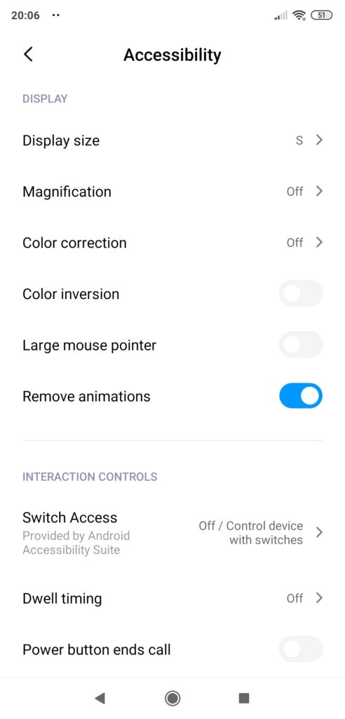
I have also found a setting on my mobile phone. Just search for “accessibility” in the settings. You will then find the switch as “Display | Remove animations”.

There are similar settings on macOS and on iPhones. I was unfortunately not able to find such a settings on my work laptop running on Manjaro linux. But if you know where to find it, please let me know!
Summary
Making a website fully accessible is not an easy task, as many aspects are not as well known as other ones. But when it somes to prioritizing the things to solve first, always start with the things that can harm your visitors. Only then continue with other aspects. I can highly recommend the talk “Prioritizing Accessibility” by Sarah Brodwall from the last Accessibility Club Summit Berlin.
I hope you have learned a new aspect of accessibility today and I could convice you to use it on your website. If you already have a great reduced animation on one of your sites, please leave a link in the comments, so we can all learn from it.
So cool! Implemented for the little logo animation on my site, tested via Accessibility settings on macOS – works like a charm. Thanks!
Wow, that was fast! Amazing that you could easily adapt it!
[…] benefit certain people using your website. Almost 5 years ago, I had a blog post on how to “Recude motion on a website for better accessibility“. In this blog post, I’ve explained how you can change the settings in Windows 10 or […]