Every year when I write this blog post, I am amazed at how long I have been blogging already. Even though these past 12 months were not really active ones, I still like blogging from time to time.
Moving focus to other things
Even though I have not been blogging too much here, I have published a couple of blog posts, but on another blog. In September 2025, I became a father, and earlier this year, I started a (German) “dad blog”. Being a dad also takes away much of your free time, especially in the beginning. Because of that, I was not able to write a lot of “normal” blog posts. But I somehow managed to do another advent calendar. I might do the same again this year; I only need to think of a topic, since writing 24 normal blog posts will be too hard to achieve.
The numbers for the past year
While the visits to the English blog have slightly increased by around 5.3%, the visits to the German blog have plummeted by 40.7%! The Google Search Console shows a great improvement in the average position, but a slightly lower CTR. I had around 2.12 million views and 20,200 clicks.
The number of comments increased by 22 with 5 of them from me. Almost two comments per month is not too bad. But one per blog post would be nice as well. 😉
Last year’s top blog post just dropped out of the Top3 to fourth place. The other two posts from last year moved up one spot, and we have a new entry. It seems people mostly find my blog posts while debugging or fixing their systems.
On my German blog, the Top3 are a little different, but the top blog post there made the third place here on the English blog.
Projects for the rest of the year
As mentioned earlier, I still want to finish my 26 blog posts by starting another advent calendar series in December. The second project I have to finish is moving this blog to my new server. I’ve done that with all other sites already. The most important project I finally want to help finish: get Antispam Bee v3 to the general public. This has been in the making for way too long, and we have reached a point where we can really give it a try. As soon as the first beta is out, I’ll inform you here.
Conclusion
Yes, my blog is still alive. But with the other duties I have now, I can’t blog every two weeks as before. But there might be times in the future when I can go back to this again.
As every second blog birthday, there is also a soccer championship running, but this is not really my sport. Instead, for the annual video at the end of this blog post, I want to share the announcement video for next year’s WordCamp Europe:
In one week, my blog will turn 17 years old, and this is only my second blog post this year. I have some topic ideas in mind already, but first I want to write about what happened about a week ago. My WordCamp reports often cover the talks I have seen. But this blog post will be a little different.
Visiting Poland
Every year in June, for the last few years, the European WordPress community has met for WordCamp Europe. And we have been visiting a new city and country again: Kraków in Poland. This was my first “proper trip” to Poland, and the city was not disappointing. On Tuesday, we took a train from Berlin all the way to Kraków. In only around 7 hours, we arrived at our destination. But who are we?
My first WordCamp visit with my family
As some of you might have known, I became a dad at the end of last year. And anyone who also has children does know that many things change. Visiting a WordCamp is also not the same as before. Since my wife Ingrid has been joining me for many WordCamps since 2022 and as she volunteered again at WCEU, I had to plan my days differently.
Meeting the community
On Tuesday evening, we had a dinner near our apartment with some members of the German community. At the restaurant, they placed us in the “family area”, but it was more for older kids.
On Wednesday, we joined the annual WCEU Picnic organized by Patricia BT, Michelle Bulloch and Jason Rouet. I think there were around 30 people from many different countries joining. Everyone brought something to eat and drink we could share. I really like this pre-event.
Contributor Day
Thursday is traditionally reserved for the Contributor Day at WordCamp Europe. Since I was a co-lead of the Multisite Table, a table that was only added last year, Ingrid could not join and contribute. At first, my colleague Dennis, who was the main lead of the table, and I were unsure how many people would join, but had to use both tables assigned to us. I guided Manja through the process of working on a Trac ticket and submitting a patch throughout the day. At the end of the Contributor Day, Manja had a patch ready for review and feedback.
The evening of the Contributor Day was reserved for “The Social”. This year, we went to a venue with many arcade games, and everyone got 5 tokens to play some of them. There were also pool tables and a small (free) bowling area.
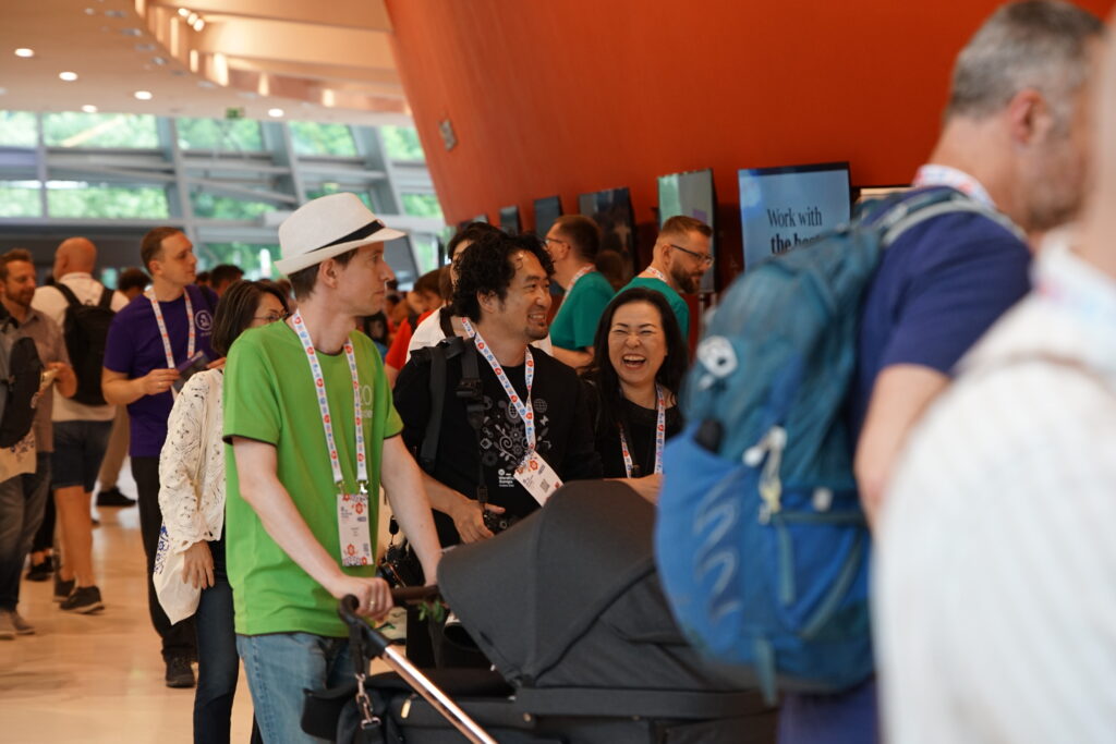
The first conference day
Since Ingrid had her first shift early in the morning, I went into the opening remarks with the bassinet stroller but had our kid out, watching the huge stage. I didn’t stay for the keynote but went to meet some people and to see some sponsors instead.
It was interesting to see how people reacted to me pushing around the bassinet stroller. I was not the only one with a small child. There were even younger ones. But having some very different conversations with people was interesting. Over the years, you have met some of the attendees many times at different WordCamps. But only this time, attending with an infant, you start talking about different topics, and people tell you that they also just became parents or already have some children a bit older. I have not known that from many of the attendees I have met multiple times before. One dad even told me that he just had a newborn 3 months ago, and even though he has much older children, he forgot many of the basic things you need to do with a baby.
After Ingrid finished her shift, we went into the talk “Accessibility in themes: easier than you think” from Jessica Lyschik for a bit, but after about 10 minutes, our child started “talking”, and we had to leave.
Another tradition at flagship WordCamps is the dinner organized by Hostinger for Contributor Day Table Leads and some other contributors. This time, we went to the Wieliczka Salt Mine near Kraków. After a tour of about an hour, we had dinner… at 135 meters deep inside the mine! What an amazing venue!
The second conference day
Ingrid had the early shift again, and we joined after the first break. I have not visited any talk before the lunch break but talked to more people and sponsors. This year, my main track was really the “hallway track”. In the afternoon, I finally manage to see (almost) a full talk.
Improving the performance of the WordPress Query classes
In this talk, Peter Wilson showed us how the Core Performance team made the WP_Query class more performant. Before the improvements, there would be 6 SQL queries on the blog listing page. The first two queries would be uncached. Since the first query is usually the most complex and long-running one, an improvement here has a large effect. He explained the steps the team had taken, how they improved it even more in a later version, and how this improvement reduced the SQL queries for “The Loop” to zero, when a persistent object cache is used. A fantastic talk with insights on how you can improve your code for better performance.
Fireside chat
Unfortunately, Matt couldn’t make it to WordCamp Europe this year, for personal reasons. It was the first WCEU he missed. At the Fireside Chat session, Matías Ventura, Mary Hubbard and Rich Tabor had a chat about differnent aspects of the WordPress project and also talked about the “WordPress in education” initiative. In the Q&A that followed, attendees could ask questions to them. Patricia asked about multilingual WordPress and when we can expect something in Core. Something many people from countries with multiple official languages need. But even I need that, since this blog is bilingual. Unfortunately, there was no good answer to that question, and Matt later answered it in a way that does sound like he sees no need for this.
Closing remarks
This is the part I’m always looking forward. The organizing team comes on stages, thanks all the teams, volunteers, speakers, sponsors, and everyone else, who helped making the WordCamp a success. WordCamp Europe 2026 was quite a big event. But to my surprise, it was still smaller than WCEU2 019 in Berlin:
But then we finally get to know where we are going next. WCEU 2027 will be the first time we go back to a country, that has hosted the event before. But see for yourself:
And sure enough, we also had an After Party. The venue had a large open space where attendees could get some great (free) food and some drinks. We could only stay for around two hours, but the organizing team was crazy enough to have the After Party running until 4:00 in the morning. I wonder how many people have stayed this long (and also went there at 20:00 already).
Some sightseeing on Sunday
Our train back to Berlin was only on Monday, so we had some time to explore the city a bit. Or at least I was finally able to. We started off with a visit to a bistro that (almost) only serves pierogi. We tried all the vegetarian and all the sweet ones, and most were really delicious.
After that, we visited the old synagoge in Kazimierz and then went on to the old town to walk the “Royal Route” starting from the Wawel Royal Castle.
We ended the day with “zapiekanka”, a traditional sandwich/baguette. A food that was recommended in various travel guides.
Conclusion
This was my 60th WordCamp (counting the unofficial “Camps” as well), and it was the first one as a father. In three weeks, we will head to my hometown, Mannheim, to attend the next one. Who knows, at one point my child might also apply as a volunteer or even a speaker. Or maybe the interest for WordCamps will not be as great, which would disappoint me a bit. But until then, I’m looking forward to seeing how my attendance in WordCamps will change now that I travel to many of them with my new family.
The past year was quite an eventful. Not necessarily on this blog, but in my personal life. Before I started my plugin advent calendar, I only had 13 blog posts written, that’s half of what I had as a target for the year. With the additional 24 blog posts, I managed to publish 37 posts in 2025. For this year, it’s probably going to be less.
Focussing on some other things
Back in July, I started to experiment with short videos on my new YouTube channel. This was a nice project, but I had to realize how much time it takes. I want to produce more videos, but that would take away some time from blogging.
The other sweet distraction is my parenthood. Taking care of a child takes away most of your free time. But it also gives you energy and brings new ideas. Even before the birth of our child, I had so many thoughts to share. Now that our family is managing the new life, there are things I would like to share with others, I wish I would have known earlier. Those things will be shared in a new blog. Since we live in Germany and some of those things are more specific to how things work in Germany, I’m not sure if I would translate them to English. But I might give it a try with automatic translations and see, if I get people to read the blog posts. As soon as I have a (sub-)domain for that new blog and my first few posts ready to be published, I will share it with you.
I also still have the plan to create a new theme for this blog, that is based on a full site editing “Block Theme”. There had been a few major changes in the Gutenberg project with the past releases and I might now have most of the things, I would need for my vision of the new theme.
Project #review26
The year 2026 seems to be perfect for another #project26, right? But it is unrealistic, that I would be able to post another 26 blog posts this year. Instead, I want to do something different. As a type of “New Year’s resolution”, I want to do something, I have not done enough in the past, and I always appreciate, if it is done: review WordPress plugins. In the advent calendar, I’ve covered 35 plugins I actively use. Some of them are plugins I contribute to and some are premium only. But for the remaining 28 plugins, I have not left a review for most of them. Since I wrote about them here, why not give back to the plugin creators by leaving a constructive review?
Conclusion
While I might not be able to publish 26 new posts on this blog, I still hope to “produce” 26 pieces of content in 2026, which might be blog posts here, on my new “dad blog” or in the form of short YouTube videos. If you have topics you would like me to cover in a video, maybe some tricks on how to use PhpStorm, which I want to have a focus on in some videos, please share your ideas in a comment here.
And do you have plans for 2026? Maybe some resolutions as well? If not, how about joining me in leaving a review to plugins you use and/or really like? I’m sure the plugin authors would be happy to see them. You don’t have to write them all in one day, you have 12 months, 52 weeks, 365 days, to write them.
This is the last blog post in this year’s advent calendar covering plugins I use. And just like yesterday, it is a plugin that I wrote, because there was no satisfying solution from the platform. The website offers a newsletter using Mailchimp. In newsletter mails, you often find a link to an anonymous web version of the email. This is also available for Mailchimp newsletters. But listing all those “archive emails” was not that easy. There is a snippet from Mailchimp, but this is using some external JavaScript. That script is using one document.write() call to show the archive on a page, and there is almost no chance to modify the look of this list. It also used a date format MM/DD/YYY and title attributes on the link, which is really bad for accessibility. All in all, the snippet is pretty useless.
The only “solution” we had to get a nice archive was adding them manually to a static page with the title and archive link, after each newsletter was sent out. But this became an annoying task over time, since you can schedule a newsletter, but had to remember yourself to update this static archive page. So, long story short, I’ve created a plugin to dynamically show the archive.
What does the plugin do?
The Campaign Archive Block for Mailchimp plugin implements a single block to pull the archive for a Mailchimp newsletter using their API. I first implemented it as a “normal plugin” with a small settings page for the API key. But then I converted it into a “Block Plugin” which can be installed from within the block editor and be used right away. This was a great learning opportunity for me. And it was equally satisfying to delete the settings page for the plugin – I really don’t like settings pages. 😅
If one of the official Mailchimp plugins is already installed and configured on the website, it uses the same API key. If none of those is installed, the API key can be added (and removed) in the block settings. The other settings of the block allow you to define the number of mails from the archive to list, you can decide to either use the mail title or subject, and you can show the sender, date and time, if you want to.
Why do I use the plugin?
I use it, because there is no official plugin to show an archive. Many newsletter providers offer official plugins to add a sign-up form to your website. But I have not found a single one that also has a plugin to show and archive of previous mails. That’s why, again, I wrote my own solution. And since Mailchimp is one of the largest newsletter providers, I’ve published the plugin in the WordPress.org Plugin Directory.
Conclusion
Just like in the plugin I presented yesterday, I could not find a good solution for my requirement to integrate a Mailchimp newsletter archive into a website. But fortunately, the Mailchimp API is quite flexible and had just the right endpoint for me. I’m also working on a new feature that would allow you to only show mails from a specific campaign folder.
I also thought about creating a similar plugin for CleverReach, a newsletter provider that is quite popular in Germany, but their API credentials handling is too complicated to be used in a block plugin. Since I don’t use any other big newsletter provider in any of my projects, I also haven’t checked their APIs.
Do you write a newsletter? And do you also list older mails on your website? Then how do you do it?
Final words on the plugin advent calendar
It was fun writing all these blog posts in the past days. It was also a lot of work, and on three Sundays, I was not able to publish the next one at midnight. But life sometimes have other plans for you. I still managed to publish all blog posts on intended plugin advent calendar day.
Did you like my blog posts and the plugins I’ve shared? Which one was your favorite?
After the alphabetical list of plugins I use, I want to present two plugins I wrote for a specific website, and then also shared. Today, we cover the first one, the Embeds for ProvenExpert plugin.
On the ProvenExpert, you can register as an expert and then get reviews and testimonials from others. They also offer different “rating seals” for your website. When I helped to integrate the seal into a website, there was only a very “hacky” PHP solution provided by ProvenExpert. This was not really satisfying for me, so I wrote a plugin and published it in the plugin directory.
What does Embeds for ProvenExpert do?
It implements multiple widgets to show the different ProvenExpert seals. Since each seal has some different options, while they share some others, I decided to create not just one widget, to make it easier to configure them. If you want to use the plugin, you have to create an API key. After storing this key in a small settings page, you are good to go and can add as many widgets as you want.
The plugin only supports widgets, so if you want to use it in a block based theme, you have to use the “Legacy Widget” block, if they are not visible in your block based widget area or if you want to use them on a page.
Why do I use Embeds for ProvenExpert?
The main reason to implement this plugin was the lack of a good integration into WordPress, when I wrote the plugin more than five years ago. Since then, ProvenExpert has also provided a JavaScript snippet. This can work, but it would require the user to have the unfiltered_html capability, as the snippet would otherwise be removed for security reasons with every content update. Implementing the widgets was also a great learning experience. I had plans to also add blocks at one point, but now this is no longer needed.
The official plugin as a replacement
It is no longer needed, since there is now an official plugin from ProvenExpert, that only supports blocks, and which is developed by the German WordPress community member Thomas Zwirner. When I’ve visited WordCamp Leipzig this year, he also informed me, that the API I am using for my plugin, might be shut down at one point. If this happens, I would probably either ask the 80+ people using my plugin to migrate to the official one, or turn mine into an add-on, that would provide widgets instead of blocks, but using the new API used by the official plugin.
Conclusion
Sometimes you come around some solutions from platforms you really don’t like. If there is no official plugin – there was a third-party one, which also didn’t satisfy me – then you often end up writing your own solution. If this solution would also help others, that’s usually when I decide to publish it into the Plugin Directory.
Have you ever done something similar? For me, it was not the first plugin I publish after needing it for one specific site. Tomorrow, in my last advent calendar blog post, I will share another plugin like this with you.
The alphabetic list of plugins comes to an end today, and which other plugin could be here than Yoast SEO? It is like a “low-hanging fruit” of plugin choices, at least for me.
What does Yoast SEO do?
I don’t know how many of you really don’t know what it does. It is the most actively used SEO plugin and one of only three plugins in the WordPress.org Plugin Directory with 10+ million active installations. You could always argue, that not every website needs an SEO plugin, WordPress itself does many things right without additional plugins, but if you want to use one Yoast SEO offers everything essential you need. There is also a premium version and many clients from the agency I work for use it, but I’m not using it myself, so I can’t really tell you too much about it.
Why do I use Yoast SEO?
It just works best for me. When you get used to one (complex) plugin and you know how to configure it, it’s hard to switch to a different one. On one page, I’ve tried a different popular SEO plugin, but it didn’t work for me. Some people say that Yoast SEO is “bloated” and that it adds too much to the admin interface. I’d say the opposite is true. That other popular SEO plugin was injecting buttons, options, panels, etc. everywhere across the editor and backend. Especially, all these “fancy AI features” and the need for an external account were quite annoying.
I also have to admit that I don’t do too much SEO for my blog posts. I need the basics, and Yoast SEO has me covered there. I don’t try to get “all green lights” in the Block Editor panel. Being able to customize some aspects of a blog post, like using an alternative title, social media image, etc. are all features I have never used. Sure, my blog could probably rank a little (or a lot) better, if I spent more time on SEO, but I enjoy writing content a lot more.
One last, and also major, reason I like about Yoast SEO, are the wonderful people of the Yoast team. It’s always fun to hang out with them at a WordCamp, visiting their booth, or even attending some parties with them. For me, the community part of some companies is also a factor on which plugin I would choose.
Conclusion
For me, Yoast SEO “just works”, and that’s all I need. But how about you? Do you use a different SEO plugin? Have you switched from Yoast SEO to this other plugin? Then what made you switch?
The Yoast Duplicate Post plugin was initially developed by Enrico Battocchi back in 2007, and when he joined the Yoast team, he brought the plugin with him. Even after rebranding, it still offers the same robust functionality.
What does Yoast Duplicate Post do?
Another plugin with a descriptive name: it is used to duplicate posts. When installed, it adds a “Clone” link to the list view of pages, posts and other post types. If you don’t configure anything, it copies the title, content, meta field values, taxonomies, and other important data. There are some things it does not copy, but those are the ones you would not expect in a clone, like comments or the date of the post. It also adds a “bulk action”, so you can clone more than one post easily.
How do I use Yoast Duplicate Post?
Some days ago, I wrote about The Events Calendar and that in the free version, it does not have a recurring events feature. This is where a plugin like this one comes in handy. If you have an event (or post, page, etc.) with very similar content, like you only change the date or some other details, creating such an event every time manually and copy/pasting all meta fields can be quite a task, where you might miss some information. Using the Yoast Duplicate Post plugin, “creating a recurring event manually” becomes a quick task. In my use case, all I need to do after duplicating the event is changing the date and the slug (since the title does not contain the date). But this only takes less than a minute and I can easily prepare many events and only schedule them to be published later.
Conclusion
There is really not a lot more to write about the plugin. In its default configuration, it just duplicates any post, page or other post type. If you want to limit this functionality to only some roles, include or exclude specific fields, that’s when you customize its settings a bit more. But in most cases, you just install and activate it and are good to go.
Have you used it before? Or do you have another plugin with a similar functionality? I know that there are multiple out there. This one just worked best for me and more than 4 million other people.
This plugin is one that is very specific for Germany. I just had to look up the English term to describe what “VG Wort” is: a performance rights organization. This organization pays authors (books, magazines, online text content), when people read them. Every new blog post gets a “tracking pixel” and any person reading my content from Germany count towards a payout. After one year, every blog post that reach at least 1500 visits from Germany, gets me some royalty payment. The amount per blog post various every year. I don’t make a lot of money, but it helps me to cover some of my hosting costs. Now that you know how getting money through VG Wort work, let’s see how this plugin helps me in the process.
What does Worthy do?
With the Worty plugin, authors can add tracking pixels to blog posts. It adds an option to the sidebar of the Block Editor and to the blog posts list view. A blog post needs to have a certain length (unless they are lyric poetry). The plugin shoes if blog posts have reach that length and then offers a link or radiobox to add a tracking pixel.
It also helps you to assign an individual tracking pixel to a single post. Getting those tracking pixels is quite a complex process. But you can download a CSV with many tracking pixels and then import them into Worthy. There is even a premium version that allows you get them imported automatically from an API and to “report” back the URL of the blog posts to VG Wort, once the blog post reach the minimum number of visits for the first time (in following years, you don’t have to report the same blog post again, it will automatically be considered for a payout, if the minimum number of visits is reach again). So since this “reporting back” only needs to be done once per blog posts and as only very few reach that limit, I have not seen the need for the premium version. But for larger blogs, it might save you more time than it costs.
Why do I use Worthy?
I have been using a different plugin for VG Wort before, but this one only helped my identifying the blog posts that are long enough and to visualize with ones already have a tracking pixel assigned. Adding the tracking pixel was a complete manual process. I would copy the HTML tag from the CSV, paste it in a meta field in the blog post, and then copy back the URL into the CSV, so I keep track of the tracking pixels I’ve already used.
Fortunately, switching to Worthy was really simple, as it offers a migration from a handful of other VG Wort plugins. There is now an official plugin from VG Wort called “VG WORT METIS“, and it sounds like it offers all the functionality from Worthy Premium, like ordering tracking pixels from VG Wort and reporting back the URLs of the blog posts. But I don’t want to migrate just now. I might test it in my new blog and then write about that plugin in more detail.
I have long removed all classical ads from my blog and only use this rather privacy-friendly monetization option. I still had to add a section to my privacy policy, since VG Wort needs to process IP addresses, in order to find out, if a visit was coming from Germany. One interesting fact is, that the content you write does not need to be written in German. If you read this blog post in English, but from Germany, it also counts towards the minimum number of visits of the blog post topic, so I use the same tracking pixel for both languages. I do that by using a small helper plugin I’ve written, that connects MultilingualPress and Worthy. I might extend that plugin to also work with other VG Wort plugins or other translation plugins.
Conclusion
I don’t know how many of you reading my blog in English even need a plugin like Worthy. Only if you publish magazines, books, etc. in Germany or you write blog posts for an audience in Germany, signing up for VG Wort makes sense.
Are there ways you monetize your online presence, but without using classical ads, sponsored content or affiliate links?
The Roles and Capabilities in WordPress are a powerful tool to allow different users to do things in WordPress, or to prevent them from doing things. But they are also hard to understand, especially as a developer trying to customize them. When you introduce a custom post type, create dashboard panels, or offer some other functionality that should only be available for some user roles, adding your own capabilities is the recommended way. But what if site owners need to change them? This is where a plugin like User Role Editor is needed.
What does User Role Editor do?
As the name says: it allows you to edit user roles and their capabilities. You can add capabilities to existing roles, create new roles or clone existing ones (to then change them). A user in WordPress can usually only have one role, but with this plugin, you can assign multiple roles to them.
The plugin also has a pro version, but I never really looked into it, since I use it only for small manipulations on the roles and capabilities of WordPress installations. In the past, I’ve also used the Members plugin, which had a similar feature set, but then changed into a larger membership plugin, which I didn’t need.
What do I use User Role Editor for?
On one website where I use Koko Analytics (which I wrote about in a previous blog post), the person responsible for the site, does not have the administrator role. Since statistics are only visible to administrator users, I had to change the roles and capabilities. I could have allowed the editor role to view statistics, by giving them the view_koko_analytics capability, but instead I’ve created a “Koko Analytics Viewer” role with that one capability and assigned it to the user. I usually try not to change the default roles from WordPress, since those changes might get overwritten.
Conclusion
If you want to change the roles and capabilities in WordPress, the User Role Editor is one of the easiest ways to do that. As a developer, you can also use the “Roles API” with functions like add_role(), to make these type of changes. I also like to use the WP-CLI and its wp role command, but you may not be able to use the CLI on a website (like I can’t in my example), and using a plugin like User Role Editor still allows you to easily change things. After you’ve done making changes, you can also often remove the plugin, since roles and capabilities are stored in the database. But if you want to keep the UI to assign a user to multiple roles, just leave the plugin installed and activated.
On one page I maintain, there is a small calendar with courses and workshops. To manage those, I had to choose a plugin that offers all the features I needed. As I had more complex requirements for an event management plugin for work projects, I decided to go with the free version of the “The Events Calendar” plugin, and here is why.
What does The Events Calendar do?
First of all, it adds a couple of custom post types: Events, Venues and Organizers. It also adds two custom taxonomies: (Event) Tags and Event Categories. You don’t really need to use all of them, but if you do, you allow people to find events in the same venue, from the same organizer, and so on.
When you create an event, you can set a start and end time, or make it an “all day event” (even spanning multiple days). For the venue, you can choose to show a map in an individual event. You can also define costs for the event, but this only shows a price. The core plugin does not offer a ticketing system, let alone payment options. There is a free add-on plugin “Event Tickets and Registration“, which allows selling of tickets with Stripe or a PayPal business account. But since registrations are not done on that website I’m using it on, I don’t have this extension installed.
In terms of listing events, you have a month, list and day view. It comes with an events list widget and a keyword search. People can subscribe via an iCalendar file, Google Calendar, Outlook 365 and Outlook Live.
Events can be edited with blocks in the Block Editor, but on the site I maintain, we use it in combination with the Classic Editor, since the UX changes were just a bit too complicated for the person running the site.
Other add-ons to the plugin
There are pro versions of the core plugin and the tickets add-on. The quality of the official extensions is very good. The prices per site are justified, if events are your main business on those sites or if you even sell tickets. For sites where events are just a minor thing, I find them too high, and would probably use external services that charge you a percentage on a ticket sale.
The free version of the calendar is lacking one major feature: displaying events of a certain category on a page. This is useful, even for a personal site, and does not justify the high price for the pro version in my opinion. Luckily, I’ve found a plugin just for this purpose: The Events Calendar Shortcode & Block. With this plugin, you can list events of a category on a page or post, using either a shortcode or a block. It even offers an Elementor widget and Bricks element, but since I don’t use those two page builders, I don’t know how well they work. Even this free plugin has a pro version, but the free one is really all I need on that one website.
There are a lot of add-on plugins in the WordPress.org Plugin Directory, and even if you don’t find one that fits, you can customize The Events Calendar quite good, since it has a lot of actions and filters, which you can find in their DevDocs or learn more about how to use the plugins in their knowledgebase. This is another strong argument for me to use this as my main events management plugin. Other plugins also offer a deeper integration into this plugin, like the MultilingualPress plugin I’ve covered some day ago.
Conclusion
When it comes to event plugins, I usually always use The Events Calendar. For one, because I’m quite used to it, but even more because I like it’s code quality. I had to use another at one point, which offers recurring events (this is only available in the pro version of The Events Calendar), but the code quality was so bad, that I hated working with it every time. With more than 700,000 active installations, just for the free version, it’s also the most used event plugin from the WordPress.org Plugin Directory.
Have you used The Events Calendar before? Or do you use a different one? What make you choose one of the alternatives?