The header was always the part of the theme, I wasn’t sure I can easily replicate. But with every new Core or Gutenberg version, there have been more options to accomplish what I want to have as an end result. I still think that I need to add some custom CSS for some changes. But let’s take a look at how far I came.
The original header
Before I show you my first result, which I achieved just using the Site Editor and all available settings, let’s take a look at the original header again:
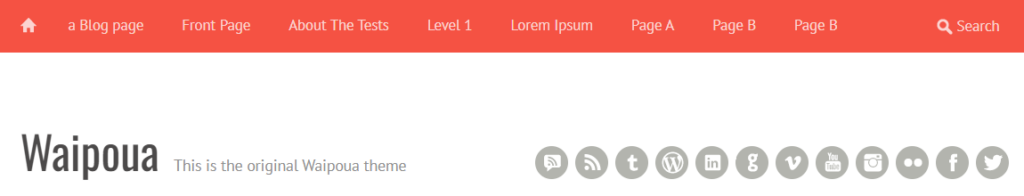
The actual “header” of the Waipoua theme is only row with the red background. The site title, site description and the “Header Widget Area” with the “Social Links Widget” are in the “wrapper” element for the content. But for the new theme, I decided to treat the whole area shown as the header.
The new header
So without further ado, let’s take a look at how far I came, rebuilding it with the Site Editor only. This is the first result:
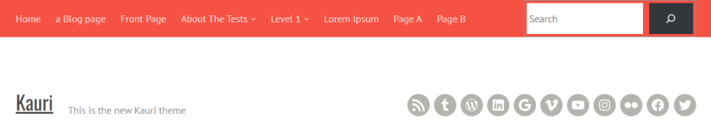
You can already spot some clear differences. It starts with the “Home Link” block, the first element of the navigation, which does not support an icon. I will probably fix this with some custom CSS and a background image, and making the “Home” text “visually-hidden”.
The other clear difference is the search field. In the Waipoua header, this field has a transparent background. The icon is just a background image, and the search form does not have a “submit button”. When focused, the input grows a bit in width, and the background becomes white, while the icon and placeholder text become gray. This is a nice effect, and the “Search” block even supports something similar, but because it is right aligned, it would “jump to the left and grow to the right”. That was not really nice. It was also less accessible this way. That’s why I decided against it. I may still change the background color, as described before, but this is not possible with the block settings. Only the background and icon color of the button could be changed. I was also not able to reduce the height of the input field.
When it comes to the “second header row”, the site title looks different, since it’s underlined and not large enough. This is also something I couldn’t change in the Site Editor for some reason. The Core styles are just more specific and would therefore overwrite any settings made in the block settings.
The icons look pretty much the same. They are 1px smaller (the “normal” size in Core is just smaller), but the icons are also centered better than in the original theme, and they use the current icons (e.g. for YouTube or Instagram). Unfortunately, there is no icon for the “Comments RSS”. I don’t know how I would solve that on my blog. But is anyone using this RSS feed anyway? 🤔
The structure of the header
Now that we have seen the result in the frontend, let’s take a look at the structure in the Site Editor and which blocks I have used:
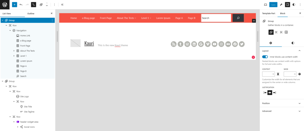
Most things are not surprising. But some details might be new to you. Did you know, for example, that you cannot only use links inside the navigation block, but also blocks like “Home Link”, “Search” or many other blocks? This is really nice, because when on a smaller screen, those block would also be in the “hamburger menu”.
The second “header row” is also quite basic in most parts. To align the site title and site description at the bottom – which I could find out how to do previously – I could simply use the “Change vertical alignment” setting.
The more interesting part is probably the social links. As mentioned earlier, this was the “Header Widget Area” in Waipoua, so I made this another template part, similar to how we did with the sidebar.
Conclusion: a lot of available settings
It’s hard to explain every step I took to implement the current header. It was just so many settings to use to come to this result. You can find the changes in the current commit to the Git repository for this theme. I was quite surprised that all settings were just saved into the template parts. I only added a new templateParts entry to the theme.json, so it would read “Header Widget Area” in the “List View” and not the slug, as in the screenshot.
My next step is trying to fix all those small differences in the header, I wasn’t able to do in the Site Editor alone. Let’s see how far I can come and how to explain, what I had to do, in the next blog post. As I just started my journey to WCEU, and have some more trains rides before me, the next blog post might come next week already.