Due to some personal topics, wasn’t able to work on the new theme, or write a new blog post for that matter. But now I’m back and will probably speed up a bit and write more frequently than just every second week. I still want to have my new theme ready by June for the blog birthday.
Adding colors
For many people, having the right (brand) colors makes a theme more recognizable. So let’s start with the main colors first. But before we start adding colors, we first have to deal with one of the hardest things in computer science: naming things.
Color names
There are different philosophies in how to name your colors. Some would go with primary, secondary, tertiary, etc. But as a non-native speaker, and being dyslexic, even the 3rd one is hard to spell correctly. And what is the 4th, 5th, etc. are named? So that why others use named like base, contrast, accent and for multiple variants, they add a numbered suffix, like contrast-2, contrast-3, etc. This is how Twenty Twenty-Four is doing it.
To be honest, I have no idea what the best way to name my colors is. But since this is a “revival” of a ElmaStudio theme, I checked how Ellen and Manuel are doing it right now. Looking at their latest themes Mugistore and SolarOne, they use combined color names like background-primary, font-primary, accent-primary, etc. So I try to go with this as well.
Assigning color values to color names
Now that I decided on which naming scheme to use, I wanted to assign all colors from the Waipoua theme to a color name in the new theme. So I first searched for all colors in the theme and found 26 different colors. That’s quite a lot! But some of those were only used for very specific CSS selectors, and others were used for colored buttons or boxes using shortcodes.
After researching every single color and where they are used, I came up with the following color definitions:
{
	"settings": {
		"color": {
			"defaultPalette": false,
			"palette": [
				{
					"slug": "black",
					"color": "#000000",
					"name": "Black"
				},
				{
					"slug": "white",
					"color": "#ffffff",
					"name": "White"
				},
				{
					"slug": "grey",
					"color": "#909090",
					"name": "Grey"
				},
				{
					"slug": "red",
					"color": "#F55243",
					"name": "Red"
				},

				{
					"slug": "background-primary",
					"color": "#ffffff",
					"name": "Background Primary"
				},
				{
					"slug": "background-secondary",
					"color": "#f6f6f6",
					"name": "Background Secondary"
				},
				{
					"slug": "background-tertiary",
					"color": "#b3b4ae",
					"name": "Background Tertiary"
				},
				{
					"slug": "background-quarternary",
					"color": "#909090",
					"name": "Background Quartenary"
				},

				{
					"slug": "font-primary",
					"color": "#333333",
					"name": "Text Primary"
				},
				{
					"slug": "font-secondary",
					"color": "#4c4a4a",
					"name": "Text Secondary"
				},

				{
					"slug": "primary",
					"color": "#f55243",
					"name": "Brand Primary"
				},

				{
					"slug": "border-primary",
					"color": "#ececec",
					"name": "Border Primary"
				},
				{
					"slug": "border-secondary",
					"color": "#dddddd",
					"name": "Border Secondary"
				},

				{
					"slug": "input-background",
					"color": "#ffffff",
					"name": "Input Background"
				},
				{
					"slug": "input-background-hover",
					"color": "#fcfcfc",
					"name": "Input Background Hover"
				},
				{
					"slug": "input-border",
					"color": "#999999",
					"name": "Input Border"
				},

				{
					"slug": "social-icons-background",
					"color": "#b3b4ae",
					"name": "Social Icons Background"
				},
				{
					"slug": "social-icons-background-hover",
					"color": "#333333",
					"name": "Social Icons Background Hover"
				},

				{
					"slug": "red-btn-box",
					"color": "#e22727",
					"name": "Red Button & Box"
				},
				{
					"slug": "green-btn-box",
					"color": "#71b247",
					"name": "Green Button & Box"
				},
				{
					"slug": "blue-btn-box",
					"color": "#56b3b7",
					"name": "Blue Button & Box"
				},
				{
					"slug": "yellow-btn",
					"color": "#f9d93a",
					"name": "Yellow Button"
				},
				{
					"slug": "yellow-box",
					"color": "#f7ec69",
					"name": "Yellow Box"
				},
				{
					"slug": "white-box",
					"color": "#fff",
					"name": "White Box"
				},
				{
					"slug": "lightgrey-box",
					"color": "#f6f6f6",
					"name": "Lightgrey Box"
				},
				{
					"slug": "grey-btn-box",
					"color": "#d3d3d3",
					"name": "Grey Button & Box"
				},
				{
					"slug": "dark-box",
					"color": "#333",
					"name": "Dark Box"
				},
				{
					"slug": "black-btn",
					"color": "#000",
					"name": "Black Button"
				}
			]
		}
	}
}
In total, these are 29 color definitions. If you open up the color picker in the block editor, like on a paragraph block, this is what you would see:
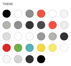
Some of the colors are “double”, but this is also how the other ElmaStudio themes do it, and I think it’s a good idea. Let’s say you want to change the social icons color only, then you can do this by changing the two specific color values. It would also be possible in the “style book”, but this is easier, especially in a customization or child theme.
Using the colors
Now that we have some colors, let’s use some of them. To get a bit more “branding” into the theme, we could start with the color for the header. As we will create the correct markup for it a bit later, let’s start with setting them in the site editor:
How do we get to this result? First, we navigate to “Appearance > Editor”. Then click into the header twice and click on the “Edit” button. Another way to get into the header template is “Appearance > Editor > Patterns >Header”, then select the header you want to edit (we currently have only one) and either click on the “edit icon” (the pencil) in the top left or simple on the header in the main window.
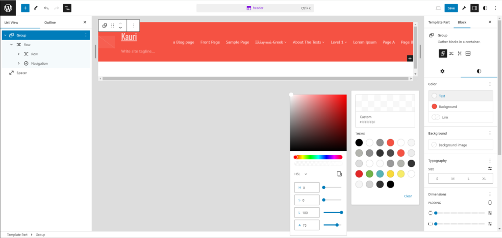
We now open the “List View” and select the top “Group” block. On the right, we select the “Block” settings and the “Styles” tab (the black/white circle). For the “Background” color, we select the “Brand Primary” color (red). Then we click on the “Text” color.
Since the Waipou theme is using a white with a 75% opacity, we first select “White” (the second color in the top row). After that, we click on the “preview area”, this is the white (in the screenshot with the “checkered pattern”) square above the one with “White #FFFFFF” (in the screenshot “Custom #FFFFFFBF”) in it. Now we can either type in a HEX code with an opacity (in this case “#FFFFFFBF”), or we click on the dropdown and select RGB or HSL and change the “A” value to “75”. This should give us the result in the screenshot.
I hope you were able to follow along. Having screenshots for every single step would have been too much. Maybe next time I have to record a video. 😀
Save changes to the theme
All the changes we have done to the header are saved into the database. They do not reflect in our theme files. To get the changes from the header template, we could just copy the raw HTML from the site editor and save it to our file. We can then safely reset the customizations in the site editor.
An easier way is using the Create Block Theme plugin again. It adds an icon into the site editor, that allows you to download the current state of the theme as a ZIP file or to save the changes directly into the theme’s folder. But be aware that this overwrites all the files. I hope you are all using version control and a good IDE, then it’s not too much of an issue, but still be careful.
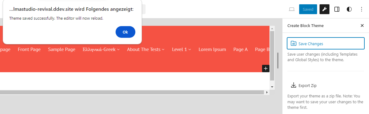
After clicking on the “wrench” icon, it will open the “Create Block Theme” plugin page. You can now click on the “Save Changes” button. This will save everything – not just the current template/part – to the theme and reset the customizations in the database.
We are going to use this option every time we made any changes to the theme using the Site Editor. Sure, we could always just write code directly into the theme.json or other files, but why would we, when instead we can more easily just build the theme in the Site Editor with a live preview.
Conclusion
Setting some colors sounds easy, but there is some planning involved as well. You want to make sure you got this right, before you start using your colors all over the place, as changing this later on might add a lot of extra work.
Now that we have made our first changes using the Site Editor, we are going to set the layout in the next step. That would be columns/sidebars, page width, elements in header and footer, etc. There were some things I didn’t though would be possible, but with WordPress 6.5 just being released, it might become easier. If that worked out, you will see in the next blog post.