Now that we have fonts and colors, we can start with the structure of the theme. Giving a page a clear structure is fundamental to enable it to be responsive later on.
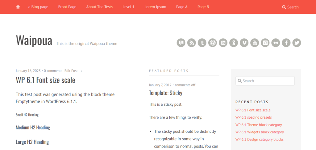
Waipoua structure
The Waipoua theme is roughly structured as followed:
- header (red background)
- home icon
- navigation
- search
- wrapper
- second header
- site title
- site tagline
- alternative: site icon added through theme options page
- social media icons
- content
- sidebar (light gray background)
- footer
- second header
The main idea of the wrapper is getting some padding on the left and right, when the display gets smaller. The red header will at a certain breakpoint become a single hamburger menu icon, that it will open a vertically sliding down navigation and search (the home icon is missing in this menu).
Blank theme structure
Now let’s look on the structure from our blank theme. This is what you get from the boilerplate (simplified):
- header
- site icon
- site title
- site tagline
- navigation
- content
- footer
Comparing this to the Waipoua theme, it is a lot simpler. But we can already see something missing: the sidebar.
Adding a sidebar
Sidebars are something you don’t see too much anymore on current websites. But for a blog theme, they still make sense in my opinion. And since I’m rebuilding a theme that has one, I have to add it. Well, the theme even has an option to have two sidebars. The second one site between the content and the main sidebar showing all sticky posts:
I couldn’t find a way to allow a selection of which template to use for all pages. Therefore, I decided to go with the single main sidebar for the first version of the theme.
But how do we even get a sidebar? We need an element, that we can use on multiple templates and that would always show the same content. The answer is: we need a “Synced Pattern”. You can create it at “Appearance > Editor > Patterns” where you click on the plus icon next to “Patterns” and select “Create pattern”. In the modal, use a name like “Sidebar” and make sure the “Synced” toggle is activated. After clicking “Create”, we can fill the sidebar. I did this in the following example with the default “widgets” from the classic theme:
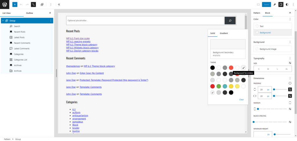
For the widget titles, I’ve used heading blocks. Some blocks need some settings being adjusted. For the Search block, I put the search button into the field and used the icon. On the Latest Comments block, I deactivated all settings, so it also shows the name and the blog post title.
One thing I’ve missed, when first creating the sidebar: adding a background color and some padding. So we also group the blocks in the sidebar, set the background color to “Background Secondary” and set the “Dimensions > Padding” to “20px” vertically and horizontally.
Placing the sidebar on the page
Now that we have the sidebar, we have to place it on every single template. Let’s start with the front page. We navigate to “Appearance > Editor > Templates” and select “Index” on the right, the only template we have so far. As mentioned earlier, the template is rather simple. It only used a “Query Loop” block as the content. This would be our “left column”. And indeed, we will use the Columns block to get our “content | sidebar” layout. The left columns will contain the Query Loop, the right one the Sidebar pattern. This is the result:
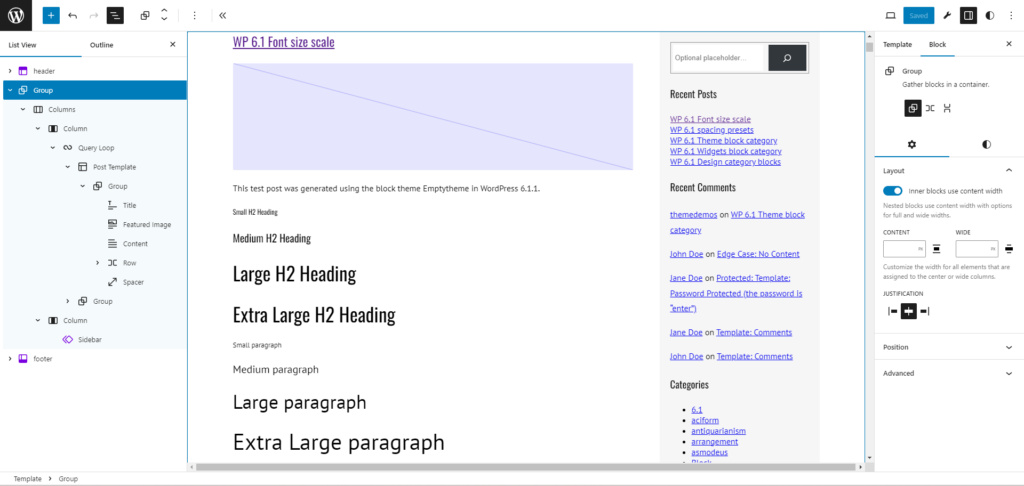
Let’s try to explain all the things I did here. First, I put the “Query Loop” into a left column and the “Sidebar” in a right column. The “Columns” block had the “Dimensions > Block Spacing” set to “50px” horizontally. The right “Column” block has a “Settings > Width” of “300px”, as the sidebar has a fixed width. The left “Column” however has an empty width value. This will allow it to take up the remaining width. So we get a responsive left column and a fixed width right column.
The group around the columns block is needed to give it a specific width. Instead of setting the width of this specific group on the “Index” template, we set it in the “Styles > Layout > Dimensions” (using the white/black icon in the top right). Here we set a fixed “Content” width of “1100px”.
The result
OK, after finishing all these steps, let’s see what we got now when visiting the front page of our new theme:
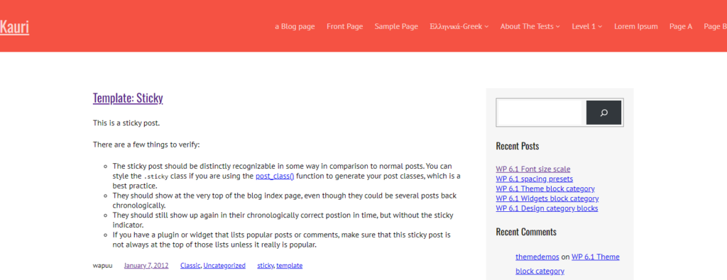
Nice! Isn’t it? OK, not really the end result we want. The blocks in the sidebar still don’t look great, but as for today, we should be happy to have our layout with the content and sidebar next to each other done.
Conclusion
When trying this layout for the first time, I struggled a bit to get it as I wanted it. I couldn’t find a way to get those “50px” in between the two columns. I had to add a middle column with “2px” width, which would get “50px” in total with the default “24px” gap. Now, with the newer version of WordPress, we have been able to just set the gap to “50px” and get the result we want. Twenty Twenty-Four is still using columns to get the correct gap. It is even using “empty columns” left and right for some padding. Fortunately, we don’t need that anymore.
For next week, I think I will continue styling the header. We will also need a “widget area” there to place the social media links, and we will also align the elements. This might be tricky, since I haven’t yet found out how to align elements at the bottom.