A friend asked me on how to show the home page with the latest blog posts as a grid instead of a list. I though a bit about how I would solve it and as I haven’t used CSS Flexbox a lot in the past, I wanted to try this out. So, on the train back to Berlin, I tinkered a bit and came up with a small solution.
Turing TwentyFifteen’s home page into a grid
I needed a theme to experiment with and again I’ve chosen TwentyFifteen, as if has enough pace to have a grid home page. So, how does the home page look like in the theme by default?
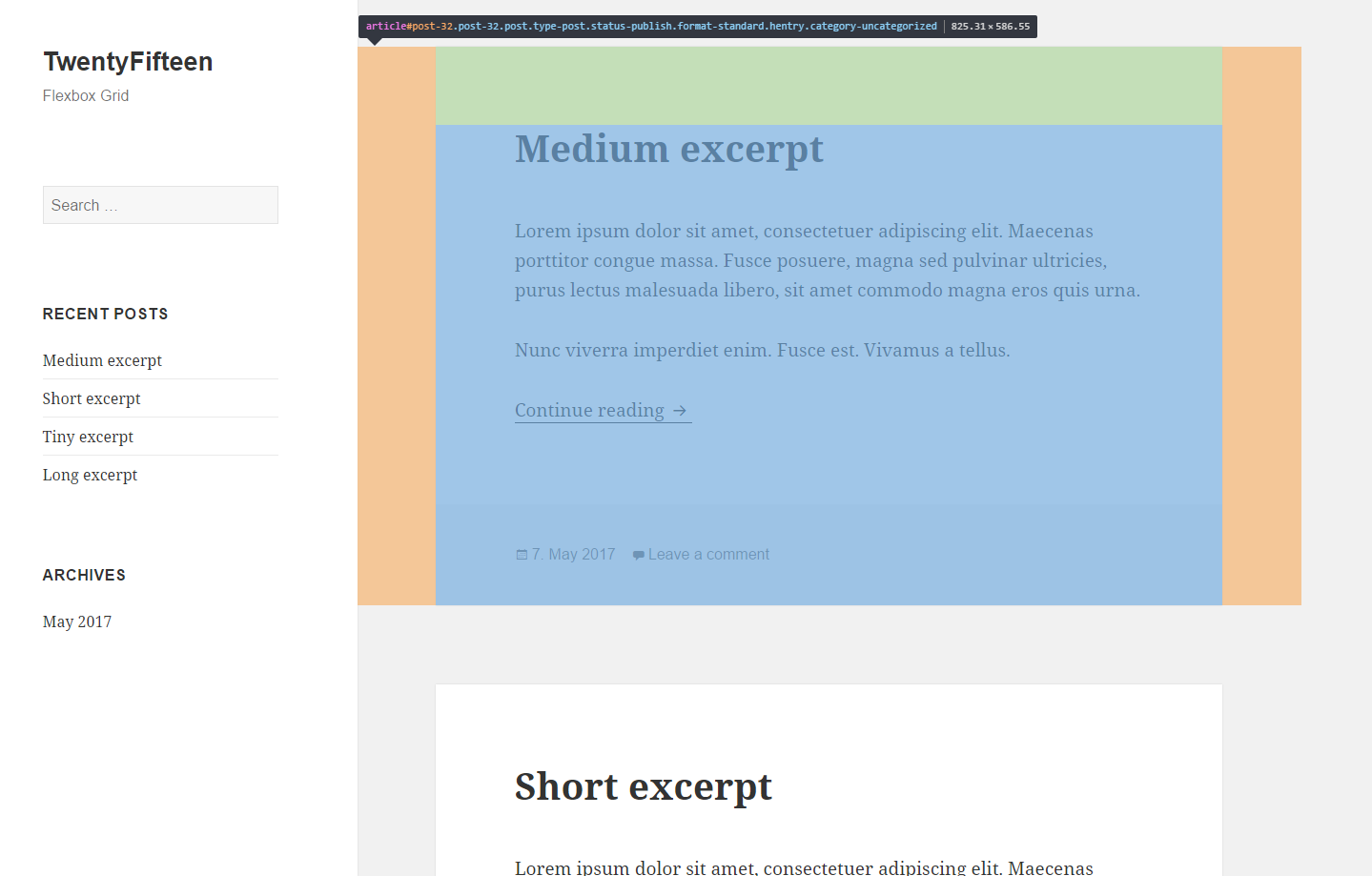
The post posts are a list of article tags, each with a margin to the sides to make the spacing and a top margin (not visible here) for the gap between the individual posts. We want to convert this into a simple grid with two columns.
Creating the basic grid
To align the article tags in rows, we only need some simple CSS flexbox properties:
.home .site-main {
   display: flex;
   flex-wrap: wrap;
}

.home .site-main > article {
   flex: 1;
}
This will place the article tags next to each other, but the heights and margins don’t really look that great:
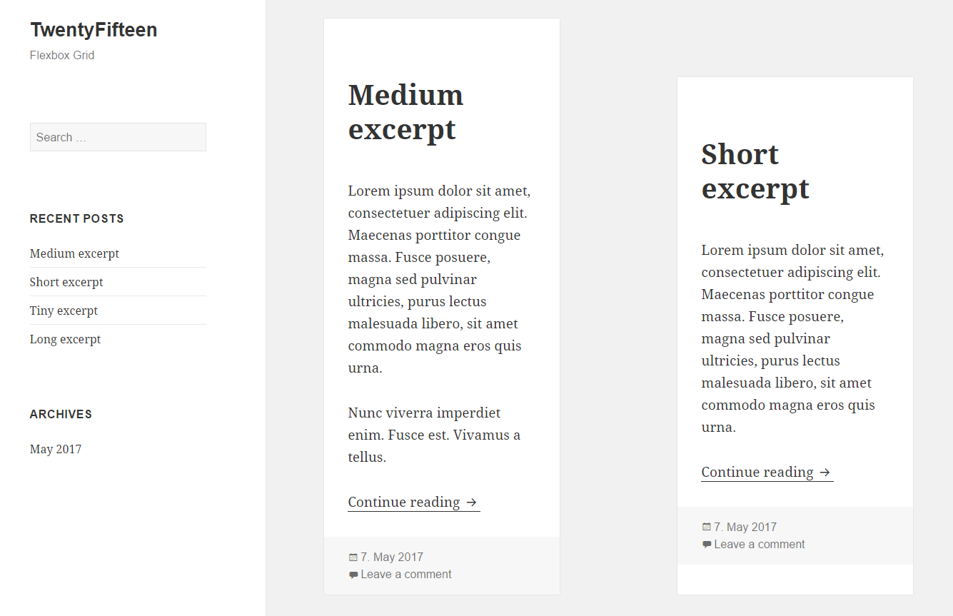
Adjust heights and margins
As we’ve seen before, each article has some margin on the sides. Those margins add up and the gap between the grid items become too wide. We remove these margins, replace them with some paddings on the container (including responsive breakpoints) and add only a small margin to each article. We also set a width per flex item (third value of the flex property):
@media screen and (min-width: 38.75em) {
	.home .site-main {
		padding-left: 7.6923%;
		padding-right: 7.6923%;
	}

	.home .site-main {
		display: flex;
		flex-wrap: wrap;
		margin: auto -2%;
	}

	.home .site-main > article {
		flex: 1 0 46%;
		margin: 0 2% 5%;
	}
}

@media screen and (min-width: 59.6875em) {
	.home .site-main {
		padding-left: 8.3333%;
		padding-right: 8.3333%;
	}
}
With these additions, the result looks pretty good:
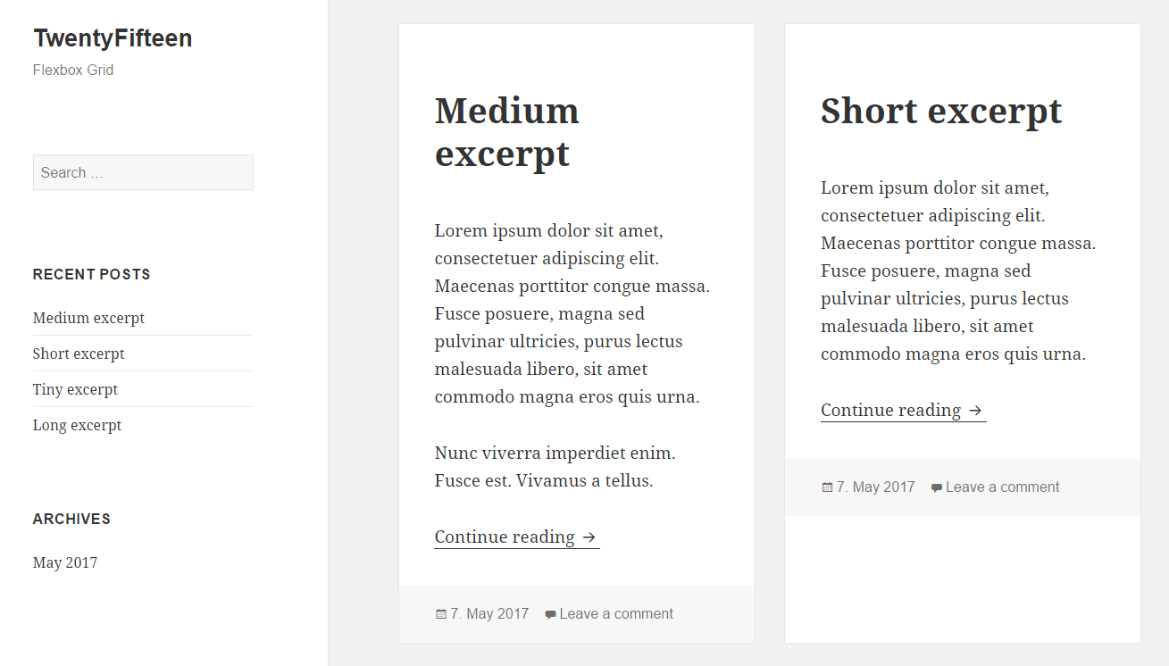
But there is still an issue. If some post excerpts are shorter than others, the article tag will have the same height, but the article footer will not be at the bottom.
Using multiple flexbox layouts
With the CSS most of you already know, this is not a very easy task. A solution we’ve used in the past, was using an absolute position for the footer and adding a bottom padding with the same height as the footer, to it does not overlap the content. But using a second flexbox layout of each article tag will solve it even easier:
@media screen and (min-width: 38.75em) {
	.home .site-main {
		padding-left: 7.6923%;
		padding-right: 7.6923%;
	}

	.home .site-main {
		display: flex;
		flex-wrap: wrap;
		margin: auto -2%;
	}

	.home .site-main > article {
		flex: 1 0 200px;
		margin: 0 2% 2%;
		display: flex;
		flex-direction: column;
	}

	.home .site-main > article footer {
		margin-top: auto;
	}
}

@media screen and (min-width: 59.6875em) {
	.home .site-main {
		padding-left: 8.3333%;
		padding-right: 8.3333%;
	}
}
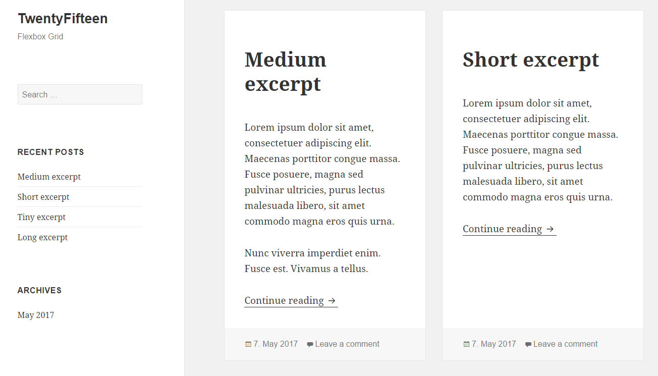
Flexbox items can be aligned on two axes. Within the article tag, we align the items on the column, rather than the row (which is the default direction used in the first flexbox). Now any property set will affect the vertical alignment. To position the footer at the bottom of the article tag, we simple have to set the top margin to auto.
The result
With those few lines, we now have a home page with a grid layout in TwentyFifteen:
You can find a theme with the example in a GIST. It can probably be improved a bit here and there, but I think the basic idea should be clear.
I would really like to experiment a bit more with flexbox. Maybe I can find an easy solution for a masonry layout of the home page using flexbox. Or do you have found such a solution already? If so, please leave a comment.