In the first advent calendar blog post with the topic HTML, I want to introduce an HTML element, some of you might not know. It’s not really its own element, but the <input> element of type color. With this element, you can add a very simple color picker to your web application.
Adding a color picker to your site
Inserting the color picker is straightforward. It’s an <input> element, and you can add a value attribute, if you want:
<input type="color" id="background" value="#000000" />
<label for="background">Background</label>
Yes, you always want to have a <label> with any form input field. If you don’t set a value, it would use #000000 as the default. You can also only set a hexadecimal RGB value, without an alpha value (transparency) so nothing like #00000066.
The color picker in different browsers
As with many other input-types, the color picker has a very different UI, depending on the operating system you are on and the browser you are using. There are some examples:
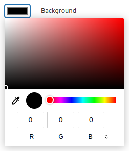
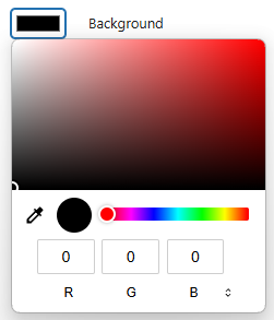
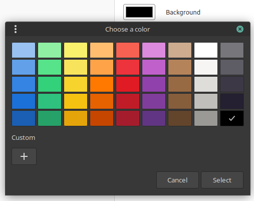
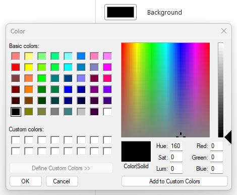
Chrome brings its own color picker, and it looks similar in Linux and Windows. Firefox on the other hand would use the native color picker from your OS.
Advanced usage with a color list
A bit hidden in the documentation of the element, you can see that the element can use a list attribute. That attribute alone would probably worth its own blog post. When you use that attribute, you can reference a <datalist> with some values. This is how it would be used:
<input type="color" id="text" list="text-colors"/>
<label for="text">Text</label>
<datalist id="text-colors">
	<option>#ff0000</option>
	<option>#00ff00</option>
	<option>#0000ff</option>
	<option>#ffffff</option>
	<option>#000000</option>
</datalist>
For the <option> values, you can also only use hexadecimal RGB values. This is how the color picker with the list looks like in Chrome:
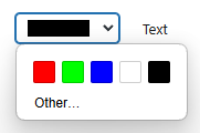
If you have more than 5 values, it will show them in up to three rows with 5 colors each If you have even more values, it will show a scrollbar. In Firefox on Windows however, it would use the same color picker as before, and list the options below the “Custom colors” in the modal.
Bonus: Using WordPress color picker components
If you are developing a WordPress project, you can use the color picker components that are available in the WordPress components library.
The ColorPicker component
In @wordpress/components you will find the ColorPicker component, that would render the color picker:
import { useState } from 'react';
import { ColorPicker } from '@wordpress/components';

function MyColorPicker() {
    const [color, setColor] = useState();
    return (
        <ColorPicker
            color={color}
            onChange={setColor}
            enableAlpha
            defaultValue="#000"
        />
    );
}
When you use the components it would render “inline”, so not open on a click on a button:
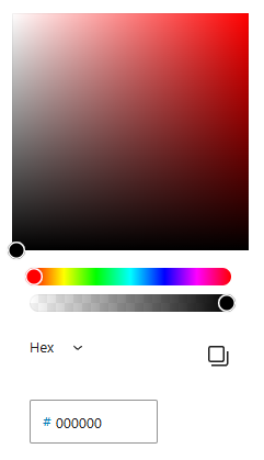
If you want to have a button to open the color picker, you would have to implement that yourself. If you add the enableAlpha attribute, you can also use an RGB value with alpha (e.g. #00000066) in the input, or you switch from “Hex” to “RGB” or “HSL”, where you would have an alpha channel range setting.
The PanelColorSettings
There is currently no documentation for the PanelColorSettings component, but this is how you would use it:
import { useState } from 'react';
import { PanelColorSettings } from '@wordpress/block-editor';
import { __ } from '@wordpress/i18n';

export const MyPanelColorSettings = () => {
	const [ textColor, setTextColor ] = useState( { color: '#000' } );
	const [ backgroundColor, setBackgroundColor ] = useState( { color: '#fff' } );

	return (
		<PanelColorSettings
			__experimentalIsRenderedInSidebar
			title={ __( 'Color' ) }
			colorSettings={ [
				{
					value: textColor.color,
					onChange: setTextColor,
					label: __( 'Text' ),
				},
				{
					value: backgroundColor.color,
					onChange: setBackgroundColor,
					label: __( 'Background' ),
				},
			] }
		/>
	);
};
In the colorSettings object, you can set multiple colors. In this example, we have one for a text and background color. This is how it would render:
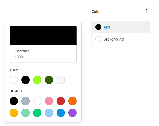
As you can see here, the PanelColorSettings will not show a generic color picker, like the ColorPicker would do. Instead, it will present you with the color presets from the theme and from Core, depending on how these color settings are defined in the theme.json file.
Conclusion
Implementing a color picker was never easier, than with the native HTML input type. No more need to add a heavy jQuery/JavaScript library. Unless you want to use a color picker inside a WordPress project and also use the color palette from the theme. Then you can use the components from the block editor. They also have the benefit, that they render in the same way in any browser and any OS.
If you need a quick color picker for some random use case, you could also just google for “color picker”. 😉