My second last blog post on the HTML topic in this advent calendar series wants to introduce an element some of you might have used, without even knowing it. But the functionality it offers you, many might have used in a website.
Toggle and accordion elements
When we only have one element that would reveal additional text on the click of a button or text, we often speak about “toggles”. If we have multiple, and only one is open at the same time, we usually refer to them as “accordions”.
In the past, we would have used a JavaScript library for such a functionality, some usual container elements and a button or link. But now, we have an element for this. If we want to have a single toggle, this would be our markup:
<details>
	<summary>Learn more about the details element</summary>
	This is text that would only be shown if the element opened.
	You can also use any other HTML elements here, you don't have
	use plain text only.
</details>
In this example, we don’t wrap our “hidden text” in any element. Most likely you would use a <p> or <div>, but really any content that comes after the <summary> will be hidden, as the element is “closed” by default. And this is how it would look like:

The right pointing arrow is there by default. The shape will look slightly different in different browser. When you click on the arrow or the text, the element will open, and the arrow now points down, indicating the element is open:

As mentioned earlier, the element is closed by default, you can open it, by adding on empty open attribute to the element:
<details open>
<!--... -->
</details>
Now, clicking on the <summary> element will close the <details> element. I cannot really think of a use-case where one would use this for a single toggle. Why hide something on a click, that was already visible?
Creating an accordion using multiple “grouped” details elements
The <details> element has only to specific attributes. We’ve already learned about open, the second one is name. If you give multiple <details> elements this attribute with the same value, they will be grouped into an according, where always only one is open at the same time:
<h2>Group one</h2>
<details name="group-one">
	<summary>First element of group one</summary>
	<p>The content of the first element of group one.</p>
</details>
<details name="group-one">
	<summary>Second element of group one</summary>
	<p>The content of the second element of group one.</p>
</details>
<h2>Group two</h2>
<details name="group-two">
	<summary>First element of group two</summary>
	<p>The content of the first element of group two.</p>
</details>
<blockquote>
	<q>Some random quote in between</q>
	<p>Some famous person</p>
</blockquote>
<details name="group-two" open>
	<summary>Second element of group two</summary>
	<ul>
		<li>Item 1</li>
		<li>Item 2</li>
	</ul>
</details>
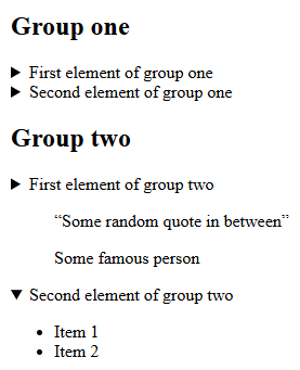
I’ve chosen a little more complex example here to show multiple things at once. First of all, we have two accordions using the name attributes values of group-one and group-two. This is how that HTML markup would render:

In group one, no element has the open attribute, so both of them are closed by default, whereas in group two, the second element has the open attribute and shows its content. In this case, the content is an unordered list, showing, that the element can contain any HTML and not only static text.
In between the first and second element of group two, we also have a blockquote. This should illustrate that you don’t need to have all <details> elements next to each other. You can have content between them.
If you open one of the other elements in the same group, the currently open element closes. If you close the open element as well, all elements are closed now. There is no (native) way to disallow closing all elements.
If you want to allow all elements to be open, just don’t use the name attribute on them. You could also use some JavaScript for an “open all” and “close all” button, that would toggle them. There is even a toggle event, you can register an event listener to. You can find out more about that in the documentation.
Styling the element
The documentation also has some basic styling examples. But is you want to see some more creative ways to style the element, take a look at the CSS-Tricks blog post covering the element.
Conclusion
When you really need to have a toggle/accordion element on your website, I can highly recommend using the native HTML elements. I personally don’t like toggle or accordions. I rather scroll through a longer page, than having to click on all these “toggles”, which also move the page up/down so you need to target the next element to click. That really frustrates me.
If you use WordPress, simply use the “Details” block, which will give you that exact element. You will have a line for the summary, and then a “Paragraph” block for the content, but you can use any block here, even multiple ones or blocks like “Group”, “Columns”, etc. to get really creative.
[…] element for this: the <dialog> element. It has some similarities with details element, I have blogged about four days ago. And if you visited the resources I’ve linked there, you might already have seen the element. […]