Four day ago, I wrote about “The prefers-color-scheme media query” and how to use it to create a dark mode for your browser. Today, I’m telling you: you might not even need it. Hm, but how do we get a dark mode then, you might ask? With a single CSS property instead of a media query.
The color-scheme property
All you need to use is one single property to tell the browser which color schemes you have. And this is how you can use it:
:root {
  color-scheme: light dark;
}
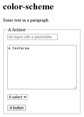
That’s it! You don’t need any more than that. Come back tomorrow for another blog post. 😁 Nah, there is more to it. But let’s see what this already does. I’ve created a page with some HTML and no CSS, other than the line above. This is how it looks like in my Chrome browser using a light mode:
And now we use the switch that I’ve shown you in the blog post “Simulate preferences in the browser” to switch to the dark mode. This is what you would get then:
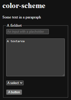
While in the light mode, all elements had a white background, the form elements and the button now have a gray background. The placeholder text of the input however has a too low contrast now.
All of this we “got for free”. Just with a single line of CSS. But this design might not please you, so how can you change it, without using the media query? There are some special “functions” you can use.
The light-dark() function
Let’s take our source code from “The prefers-color-scheme media query” blog post to see how the color-scheme can be used to create a simple dark mode. This was our old code:
button {
	padding: 10px 20px;
	font-size: 2rem;
	background-color: #eee;
	border: 3px solid #333;
	border-radius: 10px;
	color: #333;
}
@media (prefers-color-scheme: dark) {
	button {
		background: #333;
		border-color: #333;
		color: #eee;
	}
}
Now, we take this code, and place every color into the new light-dark() function, that already has a good baseline support. We first set the light color and then the dark color. It is used like this:
button {
	padding: 10px 20px;
	font-size: 2rem;
	background-color: light-dark(#eee, #333);
	border: 3px solid light-dark(#333, #eee);
	border-radius: 10px;
	color: light-dark(#333, #eee);
}
Isn’t that a lot easier to read? When we view the page with a light color scheme preference, this is what we would see:
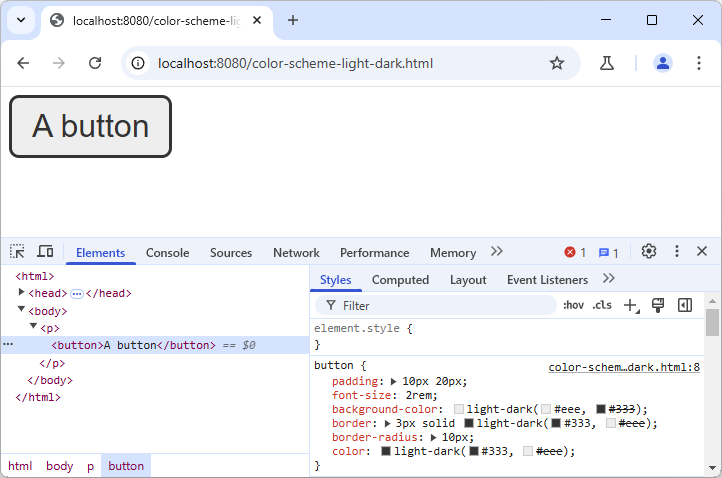
When you inspect the button, you can see the light-dark() function in the “Styles” and see/change the colors there. Now let’s view the same page with the dark color scheme preference:
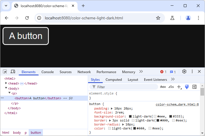
That’s the basic usage of the color-scheme property and the light-dark() function. But the property can have different values.
Switching to a dark mode by default
If you want to use the dark mode as a default for your website and not use a light mode at all, just set the color-scheme like this:
:root {
	color-scheme: dark;
}
If you want to have a light mode by default, do the opposite, and use light as the only value. As soon as you have both values light and dark, the order is not important, you will have the behavior shown above.
Preventing the dark mode
As shown in the “Simulate preferences in the browser” blog post, Chrome has an option for an “Automatic dark mode”. This will use a dark mode, even if the color-scheme is set to light. But you can prevent a dark mode, by adding the only keyword as well:
:root {
	color-scheme: only light;
}
Now the browser will not use a dark mode. And sure enough, you can also use “only dark” to get the opposite.
Setting the property for some elements only
Some website designs have that use “different color schemes” for different element. Like a website that has a dark header, but a light footer. You might want to keep those colors, even if the modes can be switched. Then you can restrict the color-scheme for some elements, but allow both for other parts:
:root {
	color-scheme: light dark;
}
header {
	color-scheme: only dark;
}
.left {
	color-scheme: light;
}
.middle {
	color-scheme: light dark;
}
.right {
	color-scheme: dark;
}
footer {
	color-scheme: only light;
}
In this code snippet, we set both color schemes for the root element, but then change it for specific parts of the page. The header and footer are limited to just one color scheme. In the main section, we have three parts. The left and right only take one scheme, the one in the middle also takes two (we could leave property for the middle one out, as it would inherit the scheme from the root element, but for completeness, I left it here).
I’ve placed our button into each of these sections. Let’s see how this looks in Chrome with the different color scheme simulations:
With “prefers-color-scheme: light”
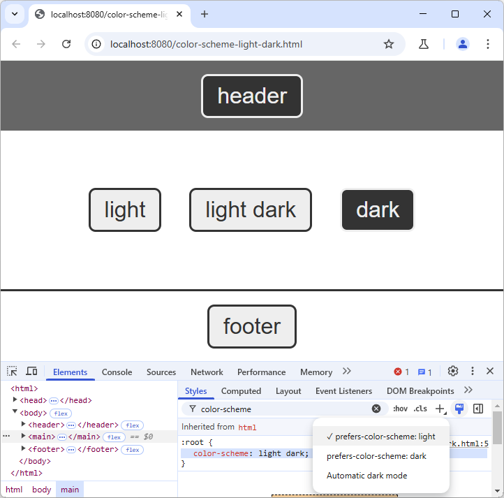
We can see here that our “color-scheme: dark” on the “.right” container has turned the button inside to the dark color-scheme.
With “prefers-color-scheme: dark”
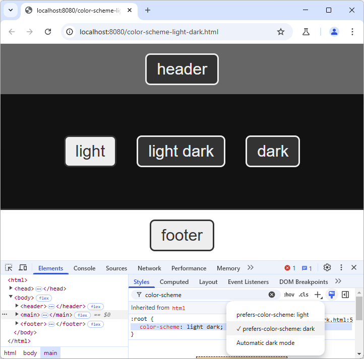
Switching to dark color scheme, the button in the middle has changed, but the other ones stayed the same. We also have a black background of the main element now, but the background colors of the header and footer stayed the same.
With “Automatic dark mode”
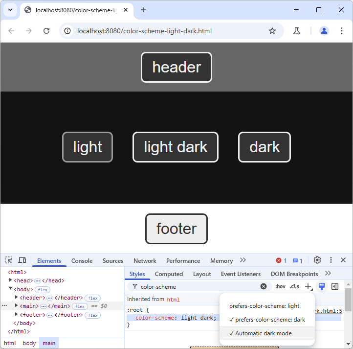
Our header and footer still stay the same. But now also the left button has turned into a dark mode, since this part is not using the “only” keyword. The border color however is darker than in our defined CSS design.
Styling your dark mode even further
Since the light-dark() function can only be used for colors, you may still have to use the prefers-color-scheme media query to change other styles in your dark mode.
If you want to be even more creative, and learn deeply about dark mode option, I can recommend the “Dark Mode in CSS Guide” CSS-Trick blog posts, as well as the two pages on the color-scheme property and on the light-dark() function.
Conclusion
Adding a dark mode to your page and testing it has never been easier than with the methods described in the past blog posts. So maybe in those dark winter days, you can also adapt with the design of your website and try to create some nice dark color scheme.