After we have seen in the last block post, how we can use modern JavaScript to write a block, I want to show why we would really want to do that by adding some options to our block. I’ll show you only the changes we have to do.
Creating an “edit” component
As a first step, we remove the edit() function from the index.js file and place it in its own file. The index.js file also have the following content left:
import { registerBlockType } from '@wordpress/blocks';
import './editor.scss';
import './style.scss';
import Edit from './edit';
import metadata from './block.json';

registerBlockType(
	metadata.name,
	{
		edit: Edit
	}
);
We import the new Edit component and assign it to options when registering the block. We also remove the import for the ServerSideRender component, as it’s no longer needed in the index.js file.
Implementing the component
Not that we have our new file imported, let’s add the ServerSideRender component again and all the things we would need for our option. The result would look like this:
import ServerSideRender from '@wordpress/server-side-render';
import { InspectorControls } from '@wordpress/block-editor';
import { Disabled, PanelBody, RangeControl } from '@wordpress/components';
import { __ } from '@wordpress/i18n';
import { useBlockProps } from '@wordpress/block-editor';
import './editor.scss';

export default function Edit( props ) {
	const {
		attributes,
		setAttributes,
	} = props;
	const {
		postsToShow,
	} = attributes;

	return (
		<>
			<InspectorControls>
				<PanelBody
					title={ __( 'Settings', 'rpssrb' ) }
				>
					<RangeControl
						label={ __( 'Number of items', 'rpssrb' ) }
						value={ postsToShow }
						onChange={ ( value ) =>
							setAttributes( { postsToShow: value } )
						}
						min="1"
						max="100"
					/>
				</PanelBody>
			</InspectorControls>
			<div { ...useBlockProps() }>
				<Disabled>
					<ServerSideRender
						block="rpssrb/random-posts"
						attributes={ attributes }
					/>
				</Disabled>
			</div>
		</>
	);
}
OK, this is a whole lot more than we had before. But let’s look at each part to understand what’s happening here.
Step 1: Importing components
In our new code, we need some React components. We will get them from different WordPress packages. We import all of them in the lines 2-5.
Step 2: Creating a function and getting the component properties
We create a function Edit and also export it as the default function right away, so it can be used in our index.js file, as we have seen in the first code snippet. The “edit” and “save” function automatically get some properties. We can “extract” those properties we need. The attributes property is an object with the attributes to the specific block. It uses a React state to live update the UI in the block editor every time a value changes. The setAttribute property is a function that is used in combination with attributes to update the state object.
As attributes is an object as well, we can also get some values from it and assign it to separate variables. We will do that with the postsToShow attribute, we will use later.
Step 3: Implementing the inspector controls
Now that we have the attribute we want to change, we can implement the controls to adjust them. The first thing that might look a little weird is that “empty tag” <> at line 12. This is necessary as the function can only have one root tag in its return statement. We basically just wrap the rest of the JSX tags wight this empty tag.
Next, we open the <InspectorControls> component, which holds all the item in the block sidebar. Inside of that, we create a <PanelBody> to have a nice title for our option, and then we add a <RangeControl> component. The result will look like this:
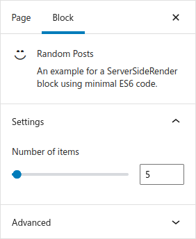
Now we have a nice little “range slider” with which we can select the number of posts to show. With the min and max attributes of the component, we define the limits of the control. The initial value will be retrieved from the previously defined postsToShow attribute and on the onChange event, we use the setAttribues function to update the value in the state. If some of these things don’t make sense at first, you’ll get familiar with them the longer you use them.
Step 4: Rendering the block
Now that we have our controls to adjust the number of posts, we need to render them in our new Edit component. We will again use the <ServerSideRender> component, but this time we add the attributes to the tag, so that the component will refresh, every time we change the value of the posts to show.
We also wrap the component inside a <div>, so we can attach all the blog properties, and we also use a <Disabled> components, so we are able to select our block in the block editor (and not opening the permalinks instead).
Step 5: Registering the attribute for the block
Any time you use an attribute for a block, you have to register it. This is done in the block.json file. The new file looks like this:
{
	"$schema": "https://schemas.wp.org/trunk/block.json",
	"apiVersion": 2,
	"name": "rpssrb/random-posts",
	"version": "0.1.0",
	"title": "Random Posts",
	"category": "widgets",
	"icon": "smiley",
	"description": "An example for a ServerSideRender block using minimal ES6 code.",
	"supports": {
		"html": false
	},
	"textdomain": "random-posts-server-side-render-block-es6",
	"attributes": {
		"postsToShow": {
			"type": "number",
			"default": 5
		}
	},
	"editorScript": "file:./index.js",
	"editorStyle": "file:./index.css",
	"style": "file:./style-index.css"
}
Step 6: Using the options in the PHP callback function
Now that we can set the option and save it, we have to use it in our PHP callback function. But fortunately that is really easy, as it is passed automatically into the function:
function rpssrb_render_callback( $atts ) {
	$args = [
		'post_type'      => 'post',
		'orderby'        => 'rand',
		'posts_per_page' => (int) $atts['postsToShow'],
	];

	// Run the query and render the posts as in the previous blog posts ...
}
This was it! I’d suggest you to look into the different components you can use in the block editor handbook. There are many you may find really useful to build your block options. Just make sure you register those new attributes as well.
Conclusion
I know this was a lot more code than in the previous two blog posts. But once you have the basics set up for the “inspector controls” you can add new controls as you want.
As I’ve explained in the first blog post to this small series, you can also split up files as much as you want. If the inspector controls get really complex, you might want to move them to their own file. But for this example I’ve wanted to keep it simple again and only use the one edit.js file.